The Higher Dimensions Series — Part Five: The Land of No Neighbors

Welcome to Part Five of the Higher Dimensions Series, where we explore some of the strange and delightful curiosities of higher dimensional space. Currently, I have completed Parts One, Two, Three, Four, and Five, with hopefully more to come. If you have not already done so, I encourage you to read the earlier parts before continuing on with our current expedition.
For the first time, we will be encountering a more practical implication of the bizarre phenomena we’ve been seeing. Granted, I mean practical with regard to applied statistics, not so much to the mundanities of everyday life. Those of you who are delighted by the abstract heady wonders of higher dimensional space, worry not! For we will still get plenty of that; however, we will also witness how one of these wonders affects a widely used (and very cool!) statistical tool. Let us depart!
The Prediction Problem
In a variety of fields, it is common that one seeks to predict the value of some response variable given the values of one or more predictor variables. Perhaps we wish to predict the probability that a patient will be re-admitted to the hospital within 30 days of discharge (response) given a variety of demographic and clinical characteristics (predictors; e.g., age, presence of co-morbidities, lab measurements). Or perhaps we wish to predict the selling price of a home given a variety of its characteristics (e.g., neighborhood, number of bedrooms, square footage). Or perhaps we wish to predict a crop yield given a variety of environmental and agricultural characteristics (e.g., rainfall, soil composition, pest management strategies).
The ability to reliably predict values for some response variable of interest is extremely powerful, and there is a vast toolbox of methods for approaching this type of problem, each with different strengths and limitations. All such methods use existing data where we have both predictor and response values (often called training data) to model the relationship between the predictors and response of interest. Then, when we have a new data point where we know the predictor values but not the response, we can use our model to estimate the response!
Today, we will focus on one of these methods in particular because it is quite intuitive and, most importantly, it gives us an opportunity observe some of the wonders of higher dimensional space! Onward!
K-Nearest Neighbors
If we had an unlimited and comprehensively diverse source of training data (i.e., data where we have both predictor and response values) for hospital patients, homes, or farms, predicting responses for different sets of predictor values would be trivial. If we wanted to predict a response for a new data point with a particular set of predictor values, we would just look at our training data, find all the data points that have the exact same predictor values, and calculate something like the mean or median of the response values observed for those training data points. The problem is that we typically don’t have such rich and voluminous training data, and we rarely have training data that spans every possible combination of predictor values. When we want to predict a response for a new data point, we may have response values for some similar training data points, but none with the exact same set of predictor values. What’s one to to do? We construct a model!
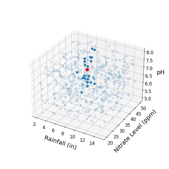
One method for modeling predictor-response relationships is called K-nearest neighbors. To understand this method, let’s think about our predictor variables as representing some higher dimensional predictor space. Perhaps you are wondering what this means, but it’s actually quite simple! If we’re working with tomato crop data, perhaps we’ve got total rainfall on the first axis (i.e., dimension), soil nitrate levels on the second axis, soil pH on the third axis, average temperature on the fourth axis, and on and on. Thus, every data point we have represents a point in higher dimensional space, where its coordinates in that space depend on its values for each of the predictor variables. For example, let’s take a look at a few points in three dimensional crop predictor space:

Here, the green point represents a crop that had 8 inches of rainfall and soil with 35 ppm of nitrate and a pH of 6.0; the blue point a crop that had 4 inches of rainfall and soil with 25 ppm of nitrate and a pH of 7.5; and the orange point a crop that had 6 inches of rainfall, and soil with 45 ppm of nitrate and pH of 7.0. Let’s say we know the crop yields associated with each of these tomato crops:
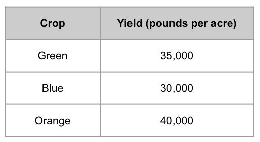
Typically, we would visually include the yield (i.e., the response variable) as an additional axis/dimension, but I’m not doing so here because we can only visualize three dimensions!
Let’s say it’s spring and we are planting a new tomato crop. We have the nitrate levels and pH of the soil and we have a pretty good idea of how much we expect it to rain. We represent this new crop below as the red point:
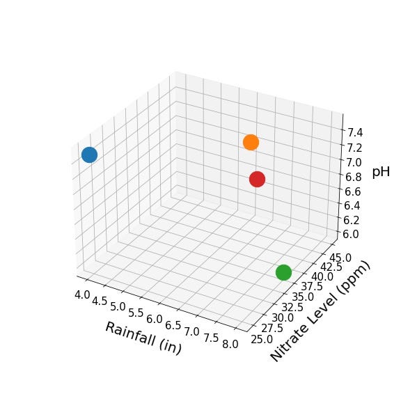
Using crop characteristics and yields from the original three points, how might we try to estimate the yield of the new red point? One approach, which we can call the (single) nearest neighbor approach, would be to use the crop yield of the closest of the three original points as the estimate. We would expect the closest point to have a roughly similar rainfall and soil composition, right? It looks like the orange point is closest to the red point, so perhaps the 40,000 pounds per acre yield that was observed for the orange point is a reasonable estimate. However, doesn’t it feel a little risky to be deriving our estimate from a single data point? Perhaps the yield associated with the orange point was a fluke, and the same characteristics any other year would’ve produced a far lower yield. With just three data points, there’s not much to be done, but what if we had hundreds of data points?
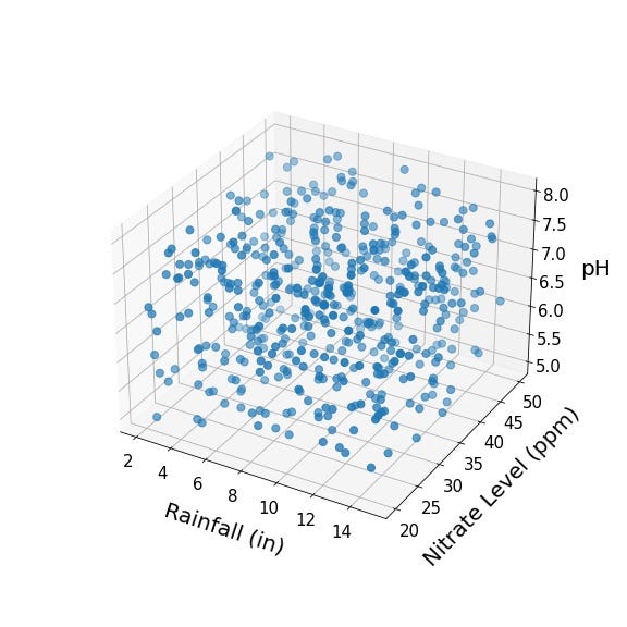
That’s more like it! Now let’s add our new crop represented by the red point:
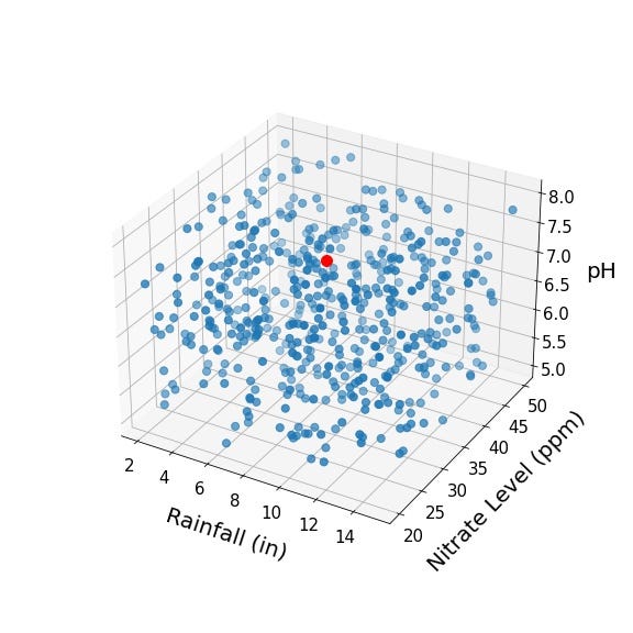
Again, we assume we know the crop yield for all of the blue points and wish to use that information to estimate the crop yield for our new red point. Shall we just take the nearest neighbor again? Nah! Why restrict ourselves to a single neighbor when we can use the K nearest neighbors! Below, we identify the 20 neighbors nearest to the red point.
To estimate the crop yield for our red point, it seems pretty reasonable to take the mean of the crop yields for these 20 nearest neighbors, right? What I like about K-nearest neighbors is that it becomes so explicit that we are operating in some higher dimensional covariate or predictor space. In this example, we are only working in three-dimensional space, but the method generalizes to any number of dimensions.
I’m sidestepping the fact that applying K-nearest neighbors involves some key design decisions. Specifically, how many neighbors should we be using? Too few neighbors and our estimate might be noisy and highly sensitive to random variability across the small number of neighbors that contribute to the estimate; too many neighbors and we might start including neighbors that are actually quite far from and thus not particularly representative of our index point (i.e., the red point in the above example). Also, how are we defining “nearest”? Plain old Euclidean distance? Or something a bit more nuanced like Mahalanobis distance (which incorporates the variability of and relationships between different predictors)? These are important (and super interesting) questions but the answers are tangential to our present journey, so I shall brush them under the rug.
Now that we understand the intuition and high-level mechanics of K-nearest neighbors, let’s take proceed onward to our favorite destination: higher dimensional space!
Greetings Neighbors!
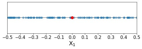
For the the onward journey, we shall retreat from our fun applied examples (e.g., patients, homes, crops) and enter a bit of a simplified space. Imagine we are working with data for which there is only one predictor variable and one response variable; thus, our predictor space is only a single dimension. Let’s also imagine that the values of our predictor variable are uniformly (i.e., evenly) distributed along the range of the predictor. For simplicity, we shall use a predictor that can only take on values between -0.5 and 0.5, such that the range of the predictor is one unit.
Again, we assume we have predictor and response values for some set of data points (which we will refer to as our training data points, because these are the points we are using to train our K-nearest neighbors model). Let’s illustrate these training data points in blue:

As we can see, the training points appear to be distributed uniformly distributed along all possible values of our single predictor. Now, we want to predict the response value for a new point (which we will refer to as the index point), added in red below:
As we learned above, the general idea of K-nearest neighbors is to identify the training data points that are closest to the index point in the predictor space (i.e., its neighbors), and then leverage the response values of those training points to estimate a response value for the index point. It is important that we only use training points that are close by in predictor space to inform our estimate. If we were to use training data points that are far away in predictor space, then they might not represent the response value for the index point very well, and our final estimate might be pretty far off from the truth. For this example, let’s say that we want to use the 10% of training data points that are closest to the index point. From our index point, how far do we need to reach in predictor space to capture 10% of the training data? More specifically, what proportion of the range of predictor values do we need to include in our neighborhood? The choice of 10% is arbitrary (and actually seems a little high for practical applications), but it’s a nice even number for our example.
The case of a single predictor is actually quite straightforward. Because the training data points are uniformly distributed along our single dimension, and the range of the predictor is one, we only need to include 10% of the range of our single predictor in order to capture 10% of the training data points. This is illustrated below:
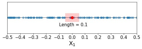
Seems reasonable, right? We don’t need to stray too far from our index point in order to include 10% of the training data in our neighborhood, just 0.05 units in either direction, which corresponds to a total length of 0.1, or 10% of the predictor’s range. It seems like the points we are including in our neighborhood (and using to estimate the response value for our index point) have predictor values that are pretty similar to that of the index point. Specifically, the index point has a predictor value of 0.0, and we are selecting points within 5% of the total predictor range in both directions.
This is all well and good, and perhaps a bit boring. What to do? Obviously, let’s see what happens when we move into a higher dimension!
The Neighborhood’s Secret
Let’s now say we have two predictors, each with a range from -0.5 to 0.5 and training data points evenly distributed along both dimensions:
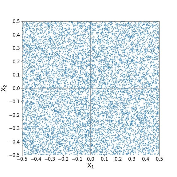
Here’s our index point:

Again, we wish to capture 10% of the training data points. What proportion of each predictor’s range must be included in the neighborhood to do so? Perhaps we can extend what we saw above in one dimension and we will need 10% of the first predictor and 10% of the second predictor. Or perhaps not! Let’s check it out (I’ve faded the training points a bit for better visibility):
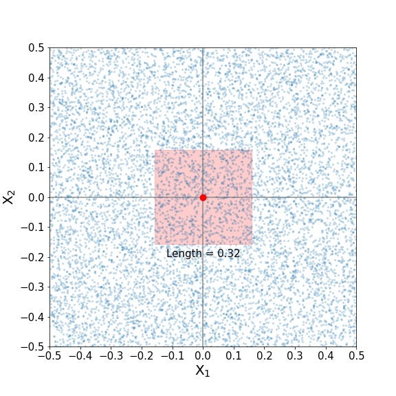
What kind of sorcery is this? Is it a typo? A nasty falsehood promulgated by an unscrupulous author? Nay, says I! It is but another twist embedded in the mysteries of higher dimensional space! Whereas in a single dimension, we only had to reach 0.05 units in either direction from the index point (or a total of 10% of the single predictor’s range) to capture 10% of the training data. Here, it appears that we must reach 0.16 units in either direction from the index point, or a hefty 32% of each predictor’s range, to capture 10% of the training data! I don’t know about you, but I’m starting to feel like the boundaries of the neighborhood are straying a bit too far. Are the the training points on the outer edges of the neighborhood really that similar to the index point anymore, in regards to their predictor values? The answer would ultimately depend on the nature of the data at hand, but we must admit that including nearly one-third of the range of each predictor seems pretty expansive when our goal is to include points with predictor values as similar as possible to those of the index point.
Onward to three-dimensional predictor space! Below we have our cloud of training data points distributed uniformly along three dimensions (left) as well as our index point (right):


Perhaps you can anticipate the answer, but I pose the question once again: how much of each predictor’s range must we include in our neighborhood in order to include 10% of the training points?

Woe is me! Nearly 50 percent! Let’s allow this to sink in. In a single dimension, we only needed to include 10% of our single predictor’s range to define a neighborhood that would encompass 10% of the uniformly distributed training data. In two dimensions, we needed 32% of each of the two predictor’s ranges. In three dimensions, we need 46% of each of the three predictor’s ranges! The underlying mathematics here are actually quite simple, curious explorers can find details below, at the conclusion of our journey.
Anyway, let’s nail this down with an applied example! Recall our crop example? pH ranges from 0–14. If our index point had a pH of 7, we’d be including training points with pH of 6.25–7.75 in one dimension (intuitively seems reasonable, right?), 4.6–9.4 in two dimensions (hmm, is that reasonable?), and 3.55–10.45 in three dimensions (wait just a minute here, that seems insane!). I don’t know much about soil chemistry but I can assure you that crops grown in soils with a pH of 7 will not behave like crops grown in soils with a pH of 3.55; in fact, I assume they wouldn’t even grow in the latter! I admit I’m being a little sloppy with my analogy, as soil pH is not evenly distributed across the range of possible values like the predictors in our example, but the general idea still stands. To capture neighboring points in two and three dimensions, we will typically need to reach farther along the range of each predictor. Does it even make sense to call these points neighbors anymore?
A Bitter Expansion
In applied statistics, it is common to work with dozens, hundreds, or even thousands of predictors. If it took nearly 50% of each predictor’s range to capture 10% of the training data in three dimensions, what will it take in 10 dimensions? 100 dimensions?
The plot below answers that question for every dimension between 1 and 100. Specifically, we have the number of dimensions (i.e., predictors) on the x-axis and the proportion of each predictor’s range (required to capture 10% of the training data) on the y-axis.
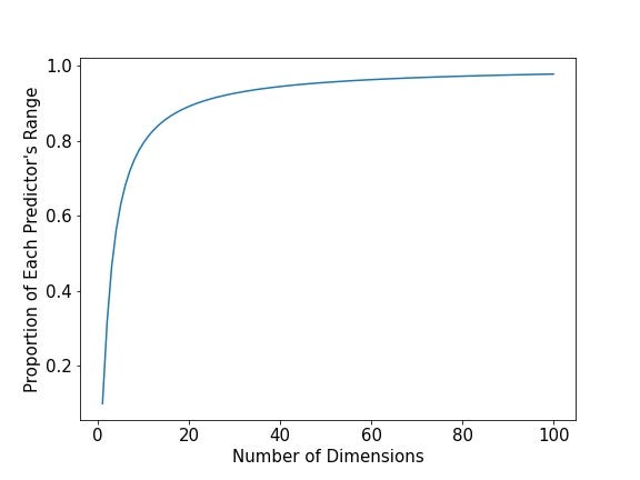
On the left-most side of the plot, we see where we’ve been with one, two, and three dimensions. However, by time we reach 10 dimensions, we need almost 80% of the range of each predictor! At 50 dimensions, we need 95 percent! At 100 dimensions, we need 98 percent! Ring the bells, for things have gotten out of control!
Recall the humble origins of our journey today. Our goal was to identify training points that have predictor values as similar as possible to those of the index point. In these higher dimensions, we are considering points with nearly any value of each predictor as a neighbor and will use them to estimate the response for our index point. In our contrived example with uniformly distributed predictors, applying K-nearest neighbors seemed completely reasonable in one dimension, but quickly because outlandish in higher dimensions. Real data sets will not look exactly like those we’ve been exploring, but this idea of needing to reach further into predictor space to find nearby points persists.
Where Have All the Neighbors Gone?
Let’s explore a slightly different question. Previously, we investigated how far field we must go to capture 10% of the training data. Now, let’s see how many neighbors we find if we restrict our neighborhood boundaries to 10% of each predictor’s range. In the context of K-nearest neighbors, it seems that training points this close in space to the index point would be well-suited to inform an estimation of the index point’s response value. In one dimension, a neighborhood that includes 10% of the single predictor’s range encompasses 10% of the training data. What happens in higher dimensions? Let’s find out!
The plot below provides the number of dimensions from 1 to 10 on the x-axis and the proportion of training data captured by a neighborhood that covers 10% of every predictor’s range (a neighborly range, indeed!) on the y-axis.
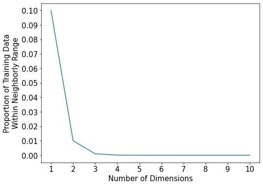
Ah! Where have all the neighbor’s gone? Again, in one dimension, our neighborly range captured 10% of the training data. In two dimensions, only 1% of the training data! If one defined an index point’s neighborhood as covering 10% of each predictor’s range, a 10-dimensional neighborhood would only include 0.00000001% of the training data!
Let’s reframe these numbers in terms of actual numbers of training data points, as opposed to percentages and proportions. Let’s say we have 100,000 training data points. That means that our 10-dimensional neighborhood would, on average, not even capture a single data point (it would capture 0.0001 data points!). This means that, on average, we’d only capture a single neighbor for every 10,000 neighborhoods! That’s a lot of empty neighborhoods!
So, with what seems like an intuitively reasonable neighborhood size that covers 10% of each predictor’s range, there are essentially no neighbors in higher dimensions. And we only went up to 10! Consider 100 dimensions! or 1000!
Journeyer beware! For thou hast entered the land of no neighbors! Where did the neighbors go? Why is are theses spaces so empty? These are timeless questions that permeate higher dimensional spaces and that have aroused (and plagued) many a statistician, exquisitely termed the curse of dimensionality! At the same time, these questions are a sweet nectar to the higher dimensional traveler’s eager and curious mind and exactly what motivate our exotic journeys.
Wrapping Up
Here concludes our harrowing journey into the emptiness of higher dimensional space. Not only have we experienced a first hand account of the loneliness of these spaces, but we have seen how this loneliness might affect the utility of a well-known statistical tool, the eminent K-nearest neighbors.
We have seen once again that higher dimensional space is full of mysteries and surprises. Characteristics that we take for granted in the comfort of our lower dimensional physical reality become unrecognizable in higher dimensions. What a time to be alive and exploring such wonders!
I hope today’s journey has left you tickled and perhaps even healthily perturbed. Take rest, for our next destination is not yet known; however, we are assured that it will be strange and full of marvels!
A Non-Mathematician’s Mathematical Appendix
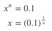
How do we calculate the proportion of each predictor’s range required to capture 10% of the training data? It’s made simple because we are working with cubes and uniformly distributed data! The volume of a hypercube is just equal to its edges’ length raised to the power of n, where n is the number of dimensions. Because we restricted our predictors to have a range of 1, the entire volume of our predictor space is always equal to 1! Because our training data were uniformly distributed throughout that volume, we know that our hypercube shaped neighborhood needs to have a volume of 0.1 to capture 10% of the training data. To calculate the edge length x of an n-dimensional hypercube with a volume of 0.1, we have:
Try applying this to one, two, and three dimensions to obtain the results discovered above!
`
